Building components
5. Creating a Movie Card component
The Movie Card component is a more advanced component compared to the ones we've built thus far. Here we will start reusing previously built components by using twig's Include and Embed statements.
By now you should know the drill, inside src/components/ create a new directory (which matches the name of the component), and inside that directory add some files.
Inside nitflex_dev_theme/src/components/ create a new directory called movie-card
Inside the movie-card directory create a new file called movie-card.json.
Inside
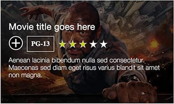
movie-card.jsoncopy the following code:{ "cover_image": "<img src='/sites/default/files/action-3.jpg' alt='' />", "heading": { "title": "Movie title goes here", "url": "#", "heading_level": 4, "classes": "movie-card__heading" }, "average_rating": "3", "mpaa_rating": "PG-13", "synopsis": "Aenean lacinia bibendum nulla sed consectetur. Maecenas sed diam eget risus varius blandit sit amet non magna.", "add_button": { "text": "Add to watch list", "type": "submit", "classes": "" } }By looking at the prototype we see that the landing page shows a listing of movies. Given the hirarchy of content we see the page aleady has a h1 and h2 in the featured movie section. Each movie category also uses a heading which will be h3, so using a h4 as the heading_level for the title of the movie in the card makes sense.
Inside the movie-card directory create a new file called movie-card.scss.
// Movie Card
//
// This is the movie card component which represents a single movie in our app.
//
// Markup: movie-card.twig
//
// Style guide: Components.Movie card

// Import site utilities.
@import '../../global/utils/init';

.movie-card {
 background: $color-black;
 color: $color-white;
 height: 250px;
 max-width: 420px;
 overflow: hidden;
 position: relative;
 transition: transform 1s ease-in-out;

 a {
   color: $color-white;
   text-decoration: none;
 }

 // By defalt image overlay is not visible until
 // hover is active.
 &::after {
   background: transparent;
   bottom: 0;
   content: '';
   display: block;
   left: 0;
   position: absolute;
   right: 0;
   top: 0;
 }

 &:hover,
 &:focus {

   .movie-card__cover-image img {
     height: 110%;
   }

   // Dark overlay.
   &::after {
     background: rgba($color-black, 0.5);
   }

   // On hover the text content fades into view.
   .movie-card__content {
     margin-top: 0;
     opacity: 1;
   }
 }
}

.movie-card__cover-image {
 height: 100%;
 left: 0;
 position: absolute;
 top: 0;
 width: 100%;

 img {
   @include center-align(absolute);
   display: block;
   max-width: none;
   transition: height 0.25s ease-in-out;
   height: 100%;
   width: auto;
 }
}

.movie-card__heading {
 font-size: 2.2rem;
 font-weight: $font-weight-regular;
 margin: 0 0 12px;
 line-height: 1;
 width: 100%;
}

.movie-card__favorites-toggle,
.movie-card__mpaa-rating {
 margin-right: 10px;
}

.movie-card__mpaa-rating {

 .mpaa-rating {
   border-color: $color-white;
   color: $color-white;
 }
}

.movie-card__average-rating {
 align-items: center;
 display: flex;
 padding: 6px 0;
}

.movie-card__synopsis {
 font-size: 1.4rem;
 padding: 8px 0;

 @include breakpoint($bp-sm) {
   font-size: 1.6rem;
 }
}

.movie-card__content {
 @include vertical-align(absolute);
 display: flex;
 flex-wrap: wrap;
 font-size: 14px;
 font-weight: 300;
 left: 20px;
 margin-top: 200px;
 right: 20px;
 transition: margin 0.5s ease 0.125s, opacity 0.5s ease 0.25s;
 overflow: hidden;
 opacity: 0;
 z-index: 2;
}
Quite the styles huh?
Inside the movie-card directory create a new file called movie-card.twig.
<article class="movie-card {{ attributes ? attributes.class }}"{{ attributes ? attributes|without(class) }}> {{ title_prefix }} {{ title_suffix }} {% if cover_image %} <div class="movie-card__cover-image"> {{ cover_image }} </div> {% endif %} <div class="movie-card__content"> {% if heading %} {% include '@nitflex_dev_theme/heading/heading.twig' with { "heading": { "title": heading.title, "url": heading.url, "heading_level": heading.heading_level, "classes": 'movie-card__heading' } } only %} {% endif %} <div class="movie-card__favorites-toggle"> {% block favorites_toggle %} {% include '@nitflex_dev_theme/add-to-favorites/add-to-favorites.twig' with { url: '#', } only %} {% endblock %} </div> {% if mpaa_rating %} <div class="movie-card__mpaa-rating"> {% include '@nitflex_dev_theme/mpaa-rating/mpaa-rating.twig' with { rating: mpaa_rating } only %} </div> {% endif %} {% if average_rating %} <div class="movie-card__average-rating"> {% include '@nitflex_dev_theme/average-rating/average-rating.twig' with { count: average_rating } only %} </div> {% endif %} {% if synopsis %} <div class="movie-card__synopsis"> {{ synopsis }} </div> {% endif %} </div> </article>IMPORTANT: There is a bug with includes in the latest twig.js (which is what KSS Node uses). Read more about here.
Notice we are using include statements to nest components into the movie-card component. This is a simple example of how we can reuse previously built components.
The image and rest of content has been split into different containers (
movie-card__cover-image&movie-card__content). This is always a good practice as it provides flexibility to move multiple content fields around at once should we have the need to do so.You notice we are reusing the heading component and simply changing its heading level and applying a unique class when inside the movie card component. This provides context and allows us to style this heading independently of other headings in the page.
Finallyt, we are introducing the concept of Twig Blocks, (not the same as Drupal blocks), to provide a way to change how content is passed or rendered when we integrate this component with Drupal. More on how Twig Blocks give us more flexibility at time of rendering content later.
Working with Drupal Libraries
Let's take a break from building components for a moment to learn about Drupal Libraries.
Previous exercise: Creating component variations
Next exercise: Drupal Libraries